


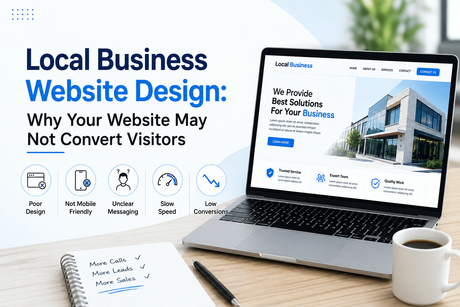
Local Business Website Design: Why Your Website May Not Convert Visitors
Local business website design should do more than make your site look good. It should help turn visitors into actual customers. Your website can look great and still not bring in a single call, form, or booking if people can’t quickly understand what you offer or figure out what to do next.
If the problem is unclear messaging, confusing navigation, weak trust signals, or a mobile experience that makes it hard to act, web design services can help fix it. Looking professional matters, but getting people to take the next step is what makes a website work.
Key Takeaways
A local website needs to explain what you do, who you help, and how to get started, fast. Small changes to content, layout, speed, and calls to action can make a real difference in how many visitors actually become customers.
- Make your services easy to understand at a glance
- Put contact options where people can actually find them
- Build trust from the first few seconds
- Make the site work on phones, not just desktop
- Build pages around what customers actually need
- Cut anything that makes contacting you harder than it should be
Why Good-Looking Websites Still Lose Customers
A polished site doesn’t automatically convert. Visitors decide fast when they land on a local business site. If they can’t figure out what you do or find what they need, they leave and call the next name on the list.
The gap is usually between design and purpose. A website should push someone toward a decision, not just sit there looking nice.
Common problems:
- No clear explanation of the main service
- Contact info that’s hard to find
- Too many menu options
- Weak calls to action
- Outdated content
- A rough mobile layout
- No reviews or trust signals
A good site makes the next step obvious. If it doesn’t, that’s the fix.
Start With What Customers Need
Good local web design starts with intent. People visiting your site want to compare services, check pricing, learn about your business, or just get in touch fast. Answer those needs without making them dig through five pages.
Think about what someone’s actually asking before they contact you:
- What does this business do?
- Do they serve my area?
- What’s this going to cost?
- Why should I trust them?
- How do I get started?
- What happens after I reach out?
Answer those clearly and people have a lot less reason to bounce.
Make the Homepage Easy to Understand
Your homepage is the first impression. It should tell visitors what you do and why they should care in seconds, not paragraphs.
A strong homepage covers:
- A clear headline
- A short service description
- A visible call to action
- Key services
- Service areas
- Reviews
- Trust signals
- Simple contact options
Don’t cram the first screen with text. Give people just enough to understand you, then point them to the next step.
Build Pages Around Important Services
One page can’t carry your whole business. If you offer several services, separate pages make the site easier to use, and easier for search engines to understand.
Each service gets its own page: useful details, common questions, benefits, the process, and a clear way to reach out.
A good service page answers:
- What is this?
- Who needs it?
- What’s the process?
- What areas do you serve?
- What should they expect?
- How do they get more info?
This also supports local SEO by tying useful service info directly to the areas you serve.
Make Mobile Users a Priority
A lot of local searches happen when someone’s out and about, ready to act right then. If your site’s clunky on a phone, you lose that customer before they ever reach out.
Keep it simple: buttons easy to tap, text easy to read, nothing important buried.
Check that:
- Phone numbers are tappable
- Contact forms work on small screens
- Buttons are easy to find
- Text doesn’t require zooming
- Menus are simple
- Images load properly
- Nothing feels cramped
If a mobile visitor has to fight your layout to find basic info, you’re losing them.
Give Visitors Reasons to Trust You
Credibility shapes whether someone contacts you at all. Local customers compare a few businesses before deciding, and clear proof makes that decision easier.
Useful trust signals:
- Customer reviews
- Testimonials
- Project photos
- Certifications
- Years of experience
- Service guarantees, where you can back them
- Clear business info
- Real team or company details
Keep it honest. The goal is helping people understand who they’re dealing with, not manufacturing confidence you can’t back up.
Make Contact Easy
A good conversion strategy removes friction. If someone wants a quote or consultation, they shouldn’t have to hunt for a phone number.
Put calls to action where people actually see them: a call, a form, a booking, an estimate.
Use:
- Click-to-call buttons
- Short contact forms
- Request-a-quote buttons
- Booking links
- Service-specific CTAs
- Contact info in the header and footer
What works depends on the business. A contractor probably needs an estimate request. A professional service is probably after a consultation booking.
Speed Can Make or Break the Experience
Nobody waits around for basic info to load. Big images, unnecessary scripts, weak hosting, and heavy page elements will slow you down and make the business feel less professional.
That doesn’t mean stripping everything out. It means every element on the page should earn its place.
Check:
- Image file sizes
- Page load times
- Unused scripts
- Large video files
- Mobile performance
- Browser and device compatibility
Google has tools for checking Core Web Vitals if you want to see exactly where your site stands.
Connect Website Design With Local Search
Your website and your local search presence should say the same thing. When someone finds you through search, your site should match what they saw in your listing:
- Business name
- Service information
- Location details
- Contact information
- Hours, if relevant
- Service areas
- Content that speaks to the customer
A site with dedicated pages for your key services and locations gives people more reasons to find you through search in the first place.
Don’t Overload Visitors With Information
More content isn’t automatically better content. A lot of local businesses cram in long blocks of text trying to explain everything. Visitors just want a clear answer.
Break things up: headings, short paragraphs, lists, images, and a clear call to action.
A simple structure works:
- What the service is
- Why someone might need it
- How it works
- What makes you different
- FAQs
- A clear way to contact you
That keeps the page easy to scan without losing the useful stuff.
Review Your Website Like a Customer
You know your business too well to see what’s confusing about your own site. A quick outside test catches what you’d miss.
Ask someone unfamiliar with your business to visit and answer:
- What does this company do?
- Which service would you pick?
- Where do they operate?
- How would you contact them?
- What makes them trustworthy?
If they struggle to answer, your messaging needs work. Running your site through our free On-Page SEO Audit tool is a fast way to catch a lot of this too: structure, content gaps, and messaging clarity, in one pass. This can also feed into a bigger website redesign if the issues run deeper than messaging.
Give Every Page a Purpose
Every important page needs a clear job. Some educate, some push toward action. Problems show up when a page has no clear purpose or sends visitors in five directions at once.
Before publishing or redesigning a page, know:
- Who it’s for
- What they’re searching for
- What info they need
- What action you want them to take
- What pages support it
- What internal links make sense
That’s what keeps content focused instead of just padding the site with more pages.
Improve the Website Based on Real Data
Don’t redesign off opinions alone. Analytics and search data show exactly where visitors land, where they leave, and what they actually pay attention to.
Look at:
- Most-visited pages
- Traffic sources
- Mobile vs. desktop split
- Contact form activity
- Click-to-call activity
- High-exit pages
- Search queries
- Conversion paths
That tells you whether a page needs better content, a stronger CTA, cleaner navigation, or a technical fix. Customer behavior shifts over time, so it’s worth checking more than once.
Build a Website That Grows With You
Your site should be built to grow alongside the business. New services, new locations, new customer questions, new campaigns, all of that should be easy to add later.
A strong site supports:
- Local search visibility
- Paid advertising
- Customer education
- Lead generation
- Brand awareness
- Repeat visits
- A better overall experience
Done right, your website stops being an online brochure and becomes an actual part of how you get customers.
Conclusion
A local business website doesn’t need to be complicated to convert. It needs to be clear, trustworthy, fast, mobile-friendly, and easy to use. Every page should help someone understand what you do and know exactly what to do next.
Fix the service pages, tighten up mobile, add real trust signals, sharpen the calls to action, and speed things up, and you’ve got a website that actually turns visitors into customers instead of just looking good.
